I came across this dataset published by Sobhan Moosavi of US car accidents from 2016 – 2021. This tutorial only starches the surface on the sorts of dashboards or models you can make. And I hope the reader finds inspiration to create their own project(s) after reading this.
I’ll provide the link to the GitHub repository that contains the Jupyter Notebook I’ve been working on. This blog will serve as a more in-depth README.
Although the years in this dataset range from 2016 – 2021, I wanted to focus on the last three years (2019, 2020, and 2021).
Initially, I had a few ideas on accident trends for those three years.
For example, I was expecting there to be fewer accidents in 2020 because of the lockdowns. I figured if people were supposed to be at home for months at a time, there wouldn’t be as much driving, so the number of accidents would be relatively more minor. However, to my surprise, there were more accidents in 2020 than in 2019 or 2021. This insight could lead to several other questions like: were there more accidents because the people on the road were already naturally risky?
Perhaps there were more accidents during 2020 because there were fewer drivers (and probably less law enforcement on roads and highways), and those who were on the road had the opportunity to speed, maneuver through lanes, and drive while distracted with more ease and freedom…but that’s pure speculation 🙃.
I could probably spend weeks chasing after new goals. Data professionals need to be cautious with what they’re working with; otherwise, they could spend too much time chasing phantom problems. 😅.
I focused on severe accidents. There were 4 ratings for each accident, with 1 having the most negligible impact on traffic and 4 having the most impact. I chose ratings 3 and 4 for the EDA process.
Plenty of tutorials will tell you to clean your data before actually using it, like dropping duplicate rows or null values. I honestly didn’t do that for this particular dataset because the attributes I was curious about (those being: Severity, Start_Time, End_Time, Start_Lat, Start_Lng, End_Lat, and End_Lng) were either not nullable or contained no null values. And the attributes that I used that were nullable were used in simple counts. So if a row has a null or NaN number, it wouldn’t affect the count.
I was fortunate that this dataset wasn’t too messy, but when working within a company, data can sometimes be incomplete or corrupt. Usually, the data analyst or data scientist doesn’t need to worry about that, but if your team is small, keep in mind that having clean data is the ideal way to begin your analyses.
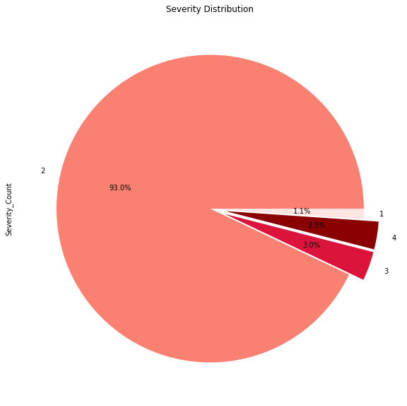
As mentioned before, I focused on severe accidents and was surprised to see that accidents with a severity of 3 or 4 between 2019 – 2021 inclusive made up less than 6% of the data.

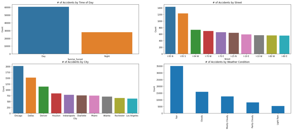
Most accidents were a level 2 during that time frame. I could also see which Cities or Streets accounted for the most severe accidents. Those insights were interesting, but what puzzled me the most was that most of these severe accidents happened during the day when weather conditions were fair!


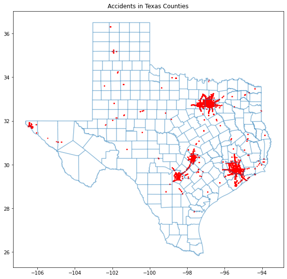
As you can see, many severe accidents occur in major cities like the Dallas-Arlington-Fort Worth area, San Antonio, Austin, and Houston.
Going into this project, I had a few ideas and thoughts on how the patterns would present themselves within this dataset. But I was wrong several times. More research can be done to dig out more insight, but I’ll leave it at this. Check out the GitHub repository to get your copy and play around with the data!
